Coronavirus Growth in The US
March 25, 2020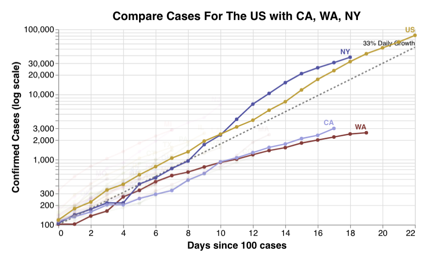
A couple of weeks ago, after seeing the first version of John Burn-Murdoch and co.’s Coronavirus data visualizations on the Financial Times, I decided that someone had to run the equivalent analysis aggregating at the state level for the US. Some searching led me to The COVID Tracking Project, a project by two journalists at The Atlantic, Robinson Meyer and Alexis Madrigal, which broke out the data exactly as I’d needed, and offered an easy to use API. After noodling around in a Jupyter notebook for a bit, I came up with this:

My tweets about the analysis were picked up by Hamel Husain who kindly offered to host my notebook in his auto-updating collection of COVID-19 Dashboards. Thanks to the magic of open source software, and a few bugs later, my analysis evolved into the image at the very top of this blog post, and unfortunately I ended up adding another chart to track deaths:

If time allows, in the next few days I’ll update the chart to include a small multiple chart inspired by some of the work that’s being done by Ben F. Maier and Dirk Brockmann.
You can read more about my thoughts on the reaction to the virus, and how the US government is handling it, over here.
Want to see more articles like this? Sign up below: